HOME PAGE
WHAT'S NEW?
JUNIOR PAGE
COACHING
WHAT IS
ORIENTEERING?
GALLERY
MAPPED AREAS
EVENTS DIARY
RESULTS
SOLUS
CLUB POLICIES
HOW TO JOIN
LINKS
CONTACT US
THE HEADLESS CHICKEN PAGES
Trust me I'm a map
Maps are an important part of our sport. This may be obvious but how much thought do you give to the maps that you use when you are out on a course? We tend to take them very much for granted and spend much more time worrying about other items of orienteering kit.
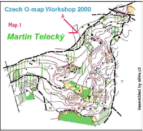
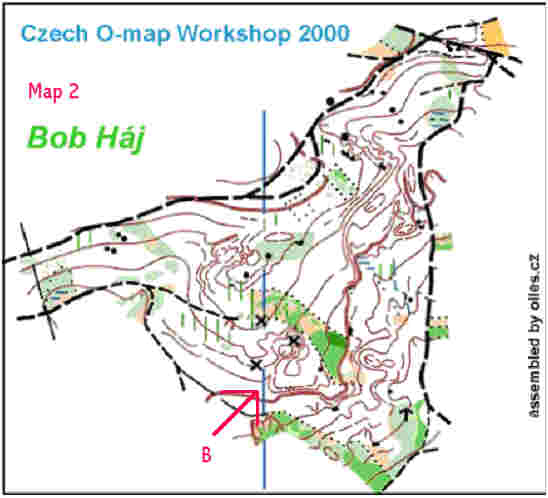
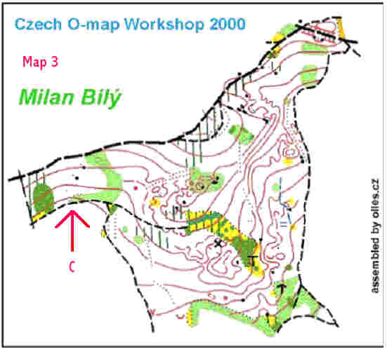
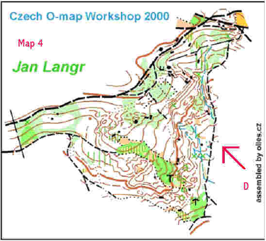
Maps have come a long way from when the sport started. In an article written by Robin Sloan of Roxbourgh Reivers about his experiences orienteering in the sixties he illustrated how maps have evolved. He wrote "For the entry fee, it has to be said, You didn't get very much, just a black and white Xerox of the Ordanance Survey map, ….. the usual map scale was 1:25 000 so there was very little detail compared to our present day 1: 10 000 maps and what detail there was would often be obscured by little tree symbols". Robin goes on to recount how a big advance was made in 1968 when the first three colour map was produced of Wauchope Forest near Hawick. The colours used were black, brown and blue, a far cry from today's maps with their wealth of information about runnability and changes in vegetation density. Well before you become too complaisant perhaps you should read on and look at the following sections of map. They are from an Orienteering Mapmaking Comparative Workshop that was held in 2000 in Czech. All of the maps are for the same area but are drawn by different individuals. All started with the same base map and had one day in which to carry out their survey. Obviously some allowances have to be made for individuals working at different speeds but it is still interesting to view the results.
Even to the most casual observer it is obvious that these maps look very different. The first thing that hits you is the difference in the amount of detail. Look at maps 1 & 4. They have the most contour detail. While map 3 gives a much more simplified view of the shape of the land. Map 4 has the most information about the runnability of the area.
The arrows drawn on the maps highlight areas where there are distinct differences.
Vegetation changes.
Map 1 - area A. Note the rectangular area with the dotted line indicating a distinct vegetation change. Compare this with the other maps. Three of the maps agree with the distinct vegetation but none of them agree about exactly what colours should be where within this small area. This is perhaps shown even more dramatically in a different area: Map 2 - area B. You will see a long band of mixed vegetation. While all 4 maps agree that there is a distinct vegetation change from the white/runnable area around this area, each mapper has their own interpretation of what is within the area.Contours and the shape of the land.
Map 2 - area B - continue looking at this portion of the map but bring your eyes to the southwest of the band of vegetation and on map 4 you will see a large depression. Compare this to map 1 which shows two small depressions in the same area.Map 4 section D seems to indicate a complex and navigationaly challenging terrain. At the other extreme is map 3 where less complexity is present in the map - you you could be forgiven for thinking that it was a completely different place.
Boulders and crags.
Boulders and crags should be relatively straight forward to map with perhaps the main difficulty being ensuring the correct plotting on the map. Well have a look at Map 3 - area C. This shows 5 boulders, 2 large and 3 small, as does map 1, though the mappers disagree about the relative sizes. However, maps 2 and 4 tell a different story.This is not an isolated case: look back to map 1 area A to the north east of the distinct block of vegetation for another example. This mapper has identified 4 crags, 2 larger than the others and 3 boulders of varying size. Now look at other maps of the same area. Between the four maps the number of black features varies from 6 to 8 with different interpretations of whether the feature is a boulder or a crag.
After looking at these maps you could be forgiven for thinking it was futile to even attempt to navigate your way around anything harder than a yellow - perhaps an orange if you were feeling adventurous! Why this is not true is because orienteers routinely adapt to and cope with these differences in style with differing levels of ease. The requirement is that there is consistency in style in the mapping and accuracy with the main features and contours. So be it a black and white photocopied map, a contour only map or one that has not been revised for some time orienteers need to decide what aspects of the map they can trust and then favour those features when choosing attack points and looking at the finer details close to a control site. And when you hear orienteers saying that a map is really good they are probably indicating that their translation of what is on the map to what they see on the ground readily lines up with how the mapper interpreted the ground features on the map.
Without actually visiting the area it is impossible to judge which map is most accurate and which would give the most enjoyable run but what we can see is that the individual mapping the area has a dramatic effect on the what the resulting map looks like.
If this subject has interested you and you would like to view the other 12 versions of this map you can find them on the web at
http://peiza.kicks-ass.net/kartritare/
Robin Sloan's article appeared in Solus in Aug 2003